A Study in Placemaking Typography
2026
Letters & Landmarks
Letters & Landmarks brings together an original typeface and a custom designed poster series that is meant to represent pieces of Denver’s visual history through a new typographic system.

Project Overview
I designed a custom typeface inspired by letters found on historical signs throughout Downtown Denver, capturing the area’s unique “typographic persona,” or the way typography can embody the look and feel of a place.
I then used the typeface in a poster series designed to spark curiosity and reconnect each letterform to its original place in Denver.
Process
The project unfolded in three phases.
Scope & Sourcing: I began by exploring several Denver neighborhoods before narrowing my focus to a few city blocks. I wanted to source the letterforms on foot and experience them within their environments.
I categorized the collected letters into uppercase and lowercase sets, photographing each one in situ to document its origin, even though I didn’t initially plan to include the photography in the final design because I intended the final product to look a little something like this:

An early attempt at visualizing the project as a cohesive display.
Along the way, the map concept became a bit more figurative, as you’ll see further down the page.
Some letters were abundant, while others were scarce or missing entirely. I filled the gaps by designing new forms, adapting existing ones, or extrapolating from the visual language of the letters I found.
I vectorized and refined each letter into a working typeface, eventually named Crackle Antiqua after the passage of time visible in the signs. I also kerned each letterform to create a functional, cohesive font.
Kerning tricky letter pairings within this mixed display typeface.
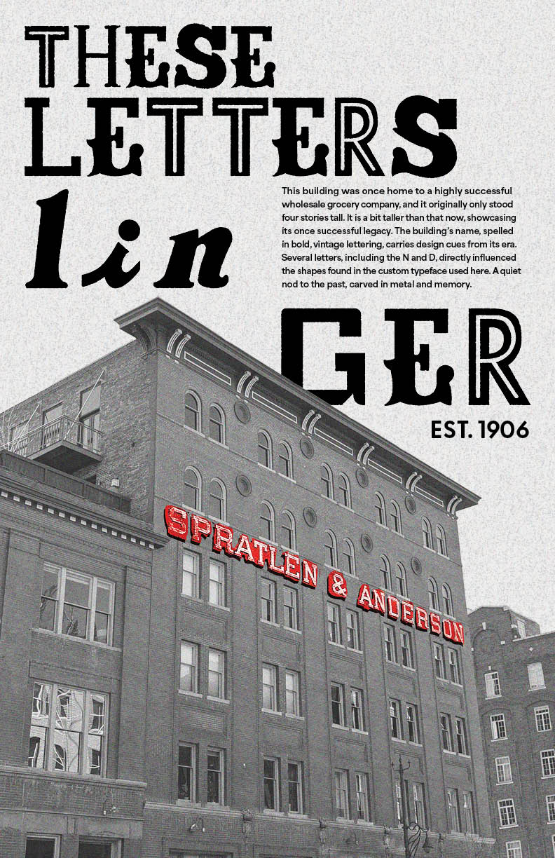
Application: Once the typeface was built, I explored how to best communicate its persona. I ultimately paired it with photographs of the original buildings and signage that inspired each letterform, giving viewers a direct connection to their Denver origins.
The posters layered cryptic sentences in Crackle Antiqua over their source imagery. I also developed a consistent visual system to highlight details within the photographs and tie the installation together. The visual language of these posters changed quite a bit from the initial style and typeface I employed.

Initial visual poster style.

The original photograph alongside the edited version used in the final poster style.
Mapping & Installation: I knew I still wanted to utilize my original map idea, so I developed the posters into a grid system showing the approximate locations where each letterform originated. Using SketchUp to plan the poster series, I experimented with a digital render to make sure the concept translated beyond the screen.
For the street labels, I created vinyl lettering from my own handwriting. This added a personal layer to a project I made primarily to reflect Denver back to its people. I enjoyed the contrast between the found letterforms and something distinctly my own.
The final system became the foundation for a 15-poster installation, bringing together unique, overlooked pieces of Denver and turning them into something unexpected, playful, and entirely new.

From a digital render to a public installation.


Outcomes
Crackle Antiqua is still evolving as I continue to refine the letterforms and fine tune their relationships with each other. Because the typeface is still being refined, some letterforms shown in the type specimen differ slightly from those used in the poster series as the posters reflect an earlier stage of the typeface's development.